Hello Testies,
I recently upgraded from my Saitek x56 controllers over to a complete Virpil setup using their Mongoost-50CM2 grip, the CM2 base, the CM2 throttle and the Ace 2 rudder pedals. One of the most striking differences was the sheer number of buttons you're able to bind on the grip and throttle. I went looking for some type of file I could use to help keep track of my mappings between the different games I'm playing but everyone I found left something to be desired. I have access to Illustrator, Photoshop and all of the acrobat tools so I decided to create my own.
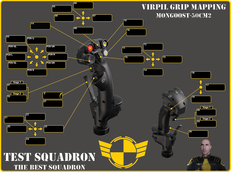
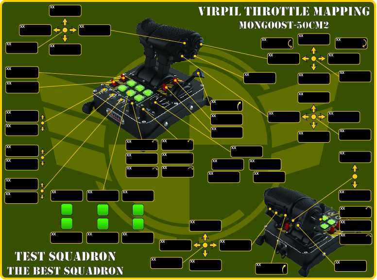
As I started laying it out and came to picking a theme I decided to move forward with a Test Squadron branded version. Below are a couple images of the first drafts and I'd love the groups feedback on these as I plan to post the final PDF version that will have editable fields for anyone to use. The style difference in terms of the background color and the placement of the logo are some ideas I'm considering.

Buttons for the grip are pretty straight forward. The numbers in each cell is the physical button number in the Virpil mapping software.

The throttle gets more complicated in that there are a lot more buttons to map and if you configure the mode selector into the 5-way mode modifier setting, many of the buttons can act as a different input for each of the five modes.
Any thoughts and feedback on which style/background color people like the best would be much appreciated. If people find value in these once completed I'd be happy to make them for some of the other controllers people are using.
Thanks in advance.
I recently upgraded from my Saitek x56 controllers over to a complete Virpil setup using their Mongoost-50CM2 grip, the CM2 base, the CM2 throttle and the Ace 2 rudder pedals. One of the most striking differences was the sheer number of buttons you're able to bind on the grip and throttle. I went looking for some type of file I could use to help keep track of my mappings between the different games I'm playing but everyone I found left something to be desired. I have access to Illustrator, Photoshop and all of the acrobat tools so I decided to create my own.
As I started laying it out and came to picking a theme I decided to move forward with a Test Squadron branded version. Below are a couple images of the first drafts and I'd love the groups feedback on these as I plan to post the final PDF version that will have editable fields for anyone to use. The style difference in terms of the background color and the placement of the logo are some ideas I'm considering.
Buttons for the grip are pretty straight forward. The numbers in each cell is the physical button number in the Virpil mapping software.
The throttle gets more complicated in that there are a lot more buttons to map and if you configure the mode selector into the 5-way mode modifier setting, many of the buttons can act as a different input for each of the five modes.
Any thoughts and feedback on which style/background color people like the best would be much appreciated. If people find value in these once completed I'd be happy to make them for some of the other controllers people are using.
Thanks in advance.


