Hi All,
Just seen the updates on ships, and was largely disappointed with the update on Carrack.
https://robertsspaceindustries.com/comm-link/transmission/16899-Reverse-The-Verse-LIVE?utm_source=Star+Citizen+Supporters&utm_campaign=0d83680c4d-Weekly+Friday+Newsletter+-+07/27/2018_COPY_01&utm_medium=email&utm_term=0_607785b0c2-0d83680c4d-40741793
There's been size changes from 123 meters to 170 then down to 125, which is fine by me, as the original concept was 123 anyway, but it's the exterior and interior changes that I don't see fit into the original concept and change the shit to the worse.
Few main points I have:
1) Aesthetic.
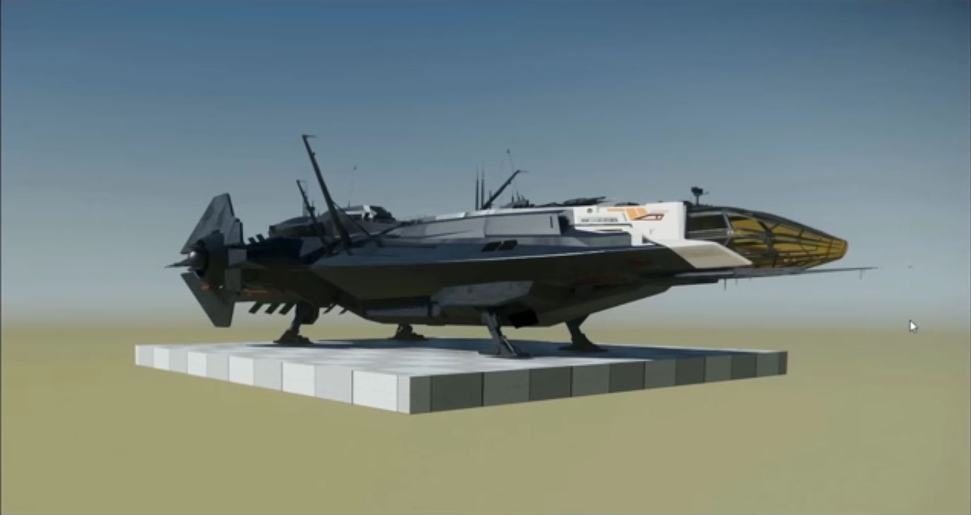
It's Anvil ex-military ship, the original concept looks like one: solid, rugged, streamlined, almost like an ex-military person still involved with private military company after turning civilian. The new Carrack looks like a fast-food addict: the ship appears awkward and bulky, with a big belly and short crippled legs.
2) Functionality.
The original long landing gear would have a great value in rugged terrain landings when you can't find a patch of even surface and have to land with rocks, trees, pits and other obstacles in your way. This is an essential feature of an explorer ship. If you've tried to land a Connie with it's tiny landing gear, you would know what I mean. The new Carrack is like that short-legged crook, which will have hard time finding a place to land. The explanation provided that it takes too much system resources to have the old gear, as it hasn't been retractable. In my view, it would make a lot more sense to make the long gear retractable, then to screw up the original concept.
The other old Carrack's essential feature was modularity and detachable modules. Looks like the new Carrack has internal modules, that you can't detach.
3) The bridge.
The old Carrack appeared to have a 2 level bridge with charting operations table and a place where the captain can oversee the whole bridge and surroundings through the glass canopy. The new bridge looks empty with Connie-like 3 seats.
Also, they've replaced the charting operations table with a 3D holosphere like on Idris and Bengal. Sounds good on a face value of it, but a desk may be used for local area charting, so that you can do some cartography and creates local area maps, for which you need a flat surface. This is another essential feature of this ship taken away.
On a potentially positive side the Carrack is getting a new snub ship, the Pieces (https://starcitizen.tools/Pisces), which is supposed to be a dedicated pathfinder ship.
I've put ahead an idea for such type of a ship for the Constellation Aquila a while ago (https://robertsspaceindustries.com/spectrum/community/SC/forum/65300/thread/aquila-more-exploration-focus-proposal-thoughts).
Now, given that the Pisces is very close to Merlin/Archimedes, it might be possible to use it in a Connie also.
However, I would be more inclined towards a normal size light exploration ship, like light fighter type, which the Carrack could carry. The functionality of the Reliant would fit well in my opinion: great view from the cockpit, 2 seater, has internal cargo capacity.
I'm not too sure about a rover though. It appears to be a single Ursa rover. So this may mean no dedicated Anvil exploration rover. Also, the old Carrack could fit 2 Ursa rovers, when the new Carrack appears to be able to only fit 1.
They've also added a rear ramp by the looks of it, which is good for access.
What do you think?
The Old Carrack

The New Carrack.

Just seen the updates on ships, and was largely disappointed with the update on Carrack.
https://robertsspaceindustries.com/comm-link/transmission/16899-Reverse-The-Verse-LIVE?utm_source=Star+Citizen+Supporters&utm_campaign=0d83680c4d-Weekly+Friday+Newsletter+-+07/27/2018_COPY_01&utm_medium=email&utm_term=0_607785b0c2-0d83680c4d-40741793
There's been size changes from 123 meters to 170 then down to 125, which is fine by me, as the original concept was 123 anyway, but it's the exterior and interior changes that I don't see fit into the original concept and change the shit to the worse.
Few main points I have:
1) Aesthetic.
It's Anvil ex-military ship, the original concept looks like one: solid, rugged, streamlined, almost like an ex-military person still involved with private military company after turning civilian. The new Carrack looks like a fast-food addict: the ship appears awkward and bulky, with a big belly and short crippled legs.
2) Functionality.
The original long landing gear would have a great value in rugged terrain landings when you can't find a patch of even surface and have to land with rocks, trees, pits and other obstacles in your way. This is an essential feature of an explorer ship. If you've tried to land a Connie with it's tiny landing gear, you would know what I mean. The new Carrack is like that short-legged crook, which will have hard time finding a place to land. The explanation provided that it takes too much system resources to have the old gear, as it hasn't been retractable. In my view, it would make a lot more sense to make the long gear retractable, then to screw up the original concept.
The other old Carrack's essential feature was modularity and detachable modules. Looks like the new Carrack has internal modules, that you can't detach.
3) The bridge.
The old Carrack appeared to have a 2 level bridge with charting operations table and a place where the captain can oversee the whole bridge and surroundings through the glass canopy. The new bridge looks empty with Connie-like 3 seats.
Also, they've replaced the charting operations table with a 3D holosphere like on Idris and Bengal. Sounds good on a face value of it, but a desk may be used for local area charting, so that you can do some cartography and creates local area maps, for which you need a flat surface. This is another essential feature of this ship taken away.
On a potentially positive side the Carrack is getting a new snub ship, the Pieces (https://starcitizen.tools/Pisces), which is supposed to be a dedicated pathfinder ship.
I've put ahead an idea for such type of a ship for the Constellation Aquila a while ago (https://robertsspaceindustries.com/spectrum/community/SC/forum/65300/thread/aquila-more-exploration-focus-proposal-thoughts).
Now, given that the Pisces is very close to Merlin/Archimedes, it might be possible to use it in a Connie also.
However, I would be more inclined towards a normal size light exploration ship, like light fighter type, which the Carrack could carry. The functionality of the Reliant would fit well in my opinion: great view from the cockpit, 2 seater, has internal cargo capacity.
I'm not too sure about a rover though. It appears to be a single Ursa rover. So this may mean no dedicated Anvil exploration rover. Also, the old Carrack could fit 2 Ursa rovers, when the new Carrack appears to be able to only fit 1.
They've also added a rear ramp by the looks of it, which is good for access.
What do you think?
The Old Carrack

The New Carrack.


