Hi All,
While the Carrack is a great ship, which was supposed to be the king of exploration, there are a few things I don't like about it's current state, so wanted to check what do you think.
I have raised some of these points back in 2018 when I've seen the updates on the Carrack. And some of these points are still relevant on my opinion.
So, what I don't like in the Carrack's current state:
1) Landing gear.
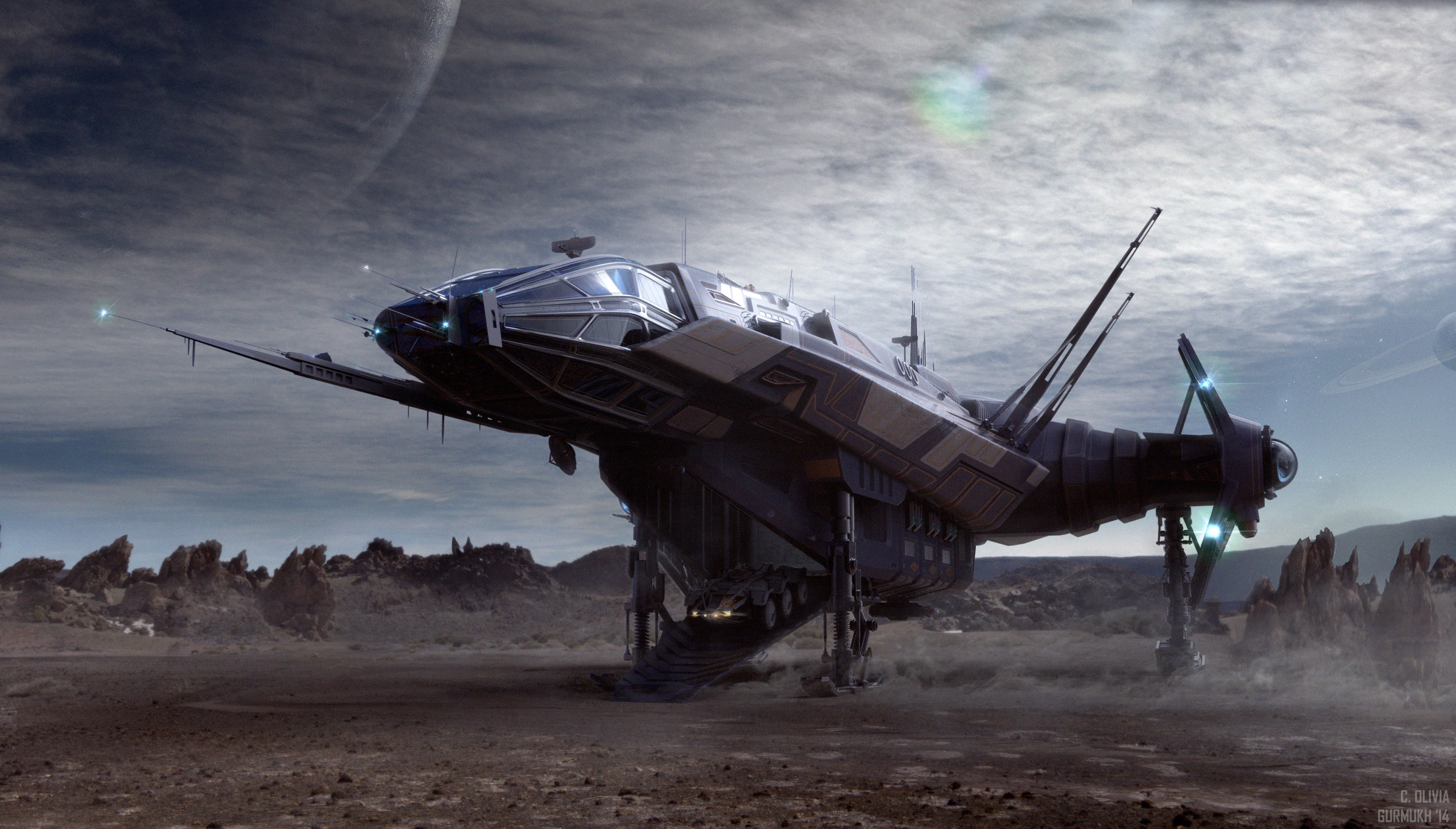
I've had some hard time to land Carrack on rugged terrain. It's a large ship, but it has a tiny landing gear. So, some small rocks can make your landing impossible. Look at the original long landing gear - it would have no problem with landing on rugged terrain when you can't find a patch of even surface and have to land with rocks, trees, pits and other obstacles in your way. I still believe that the ability to land almost on any terrain is an essential feature of an explorer ship.
Also, 4 supports would make the ship more stable, and you may be able to level it better. The current tiny gear makes the ship not level when you land elsewhere than a landing pad.
Maybe you could even have an adjustable gear - make it short when you have an even flat surface, and make it long when the terrain is rough.
The original Carrack landed.
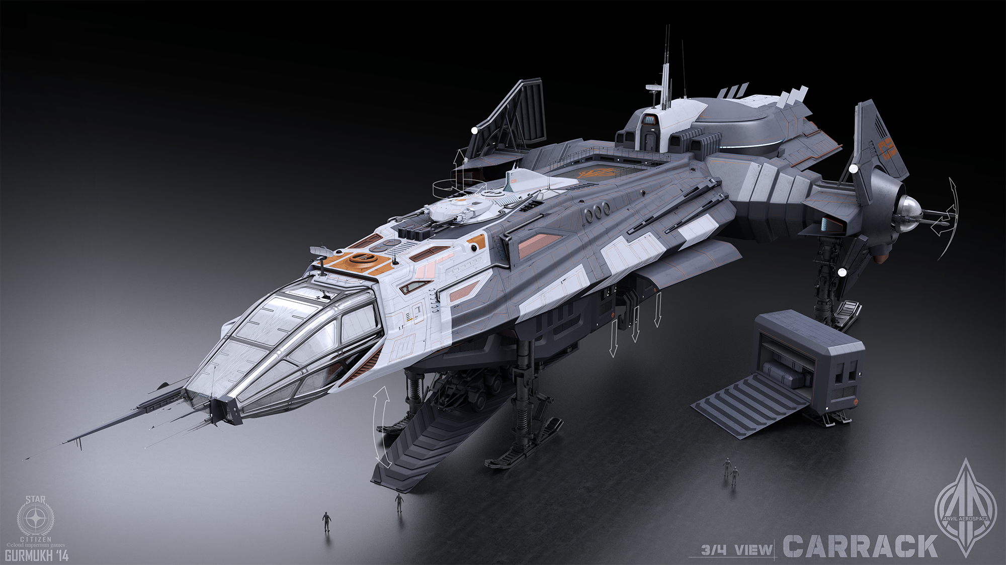
The current version of the Carrack has tiny landing gear - almost can't see it, - small unevenness of terrain makes landing difficult.
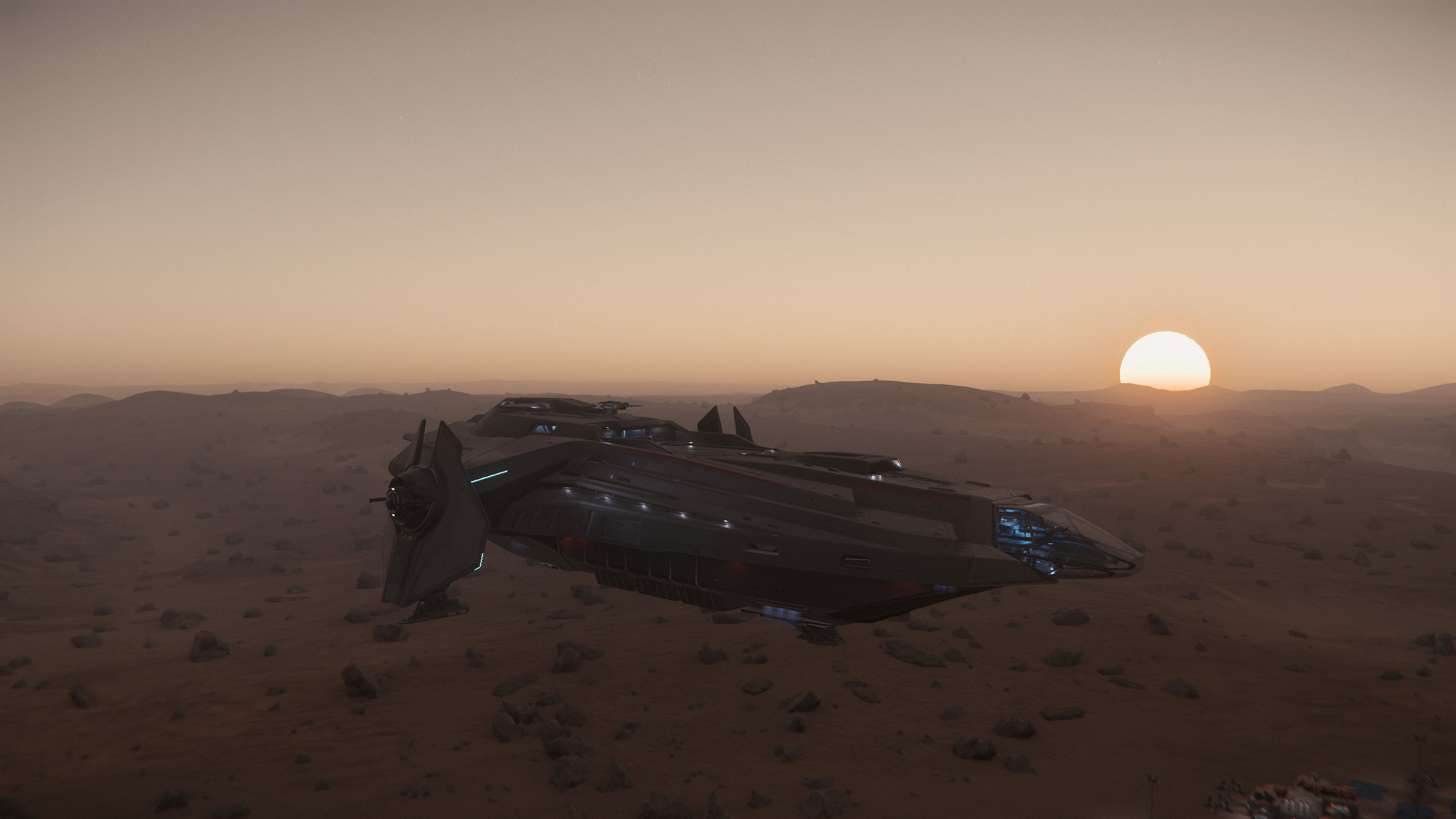
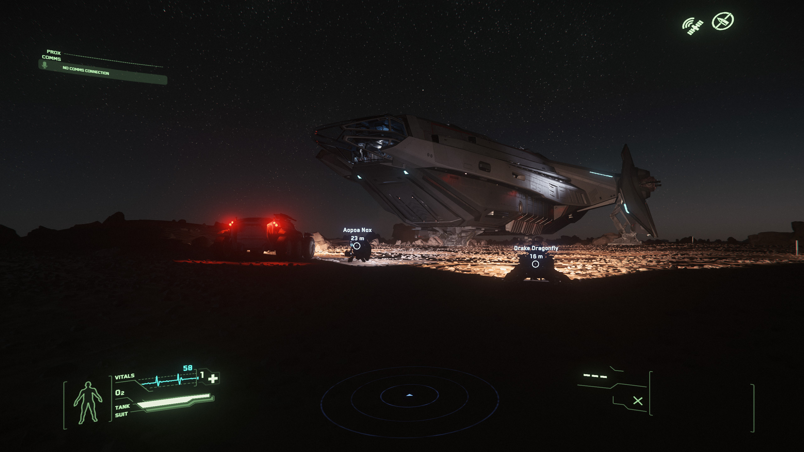
You can see how low the ship is to the ground. Those rocks are human height. I had to move the ship, before the landing gear could touch the ground properly.
2) Bridge.
I would like the pilot seat to go more forward, otherwise my side view is blocked by air intakes. There is plenty of room to move the seat forward, and there already is a rail on which the seat can move forward.
Also, I would still want the holotable for flat (or 3d) area maps. It could just be functionality, so that the round table can also project a flat (or 3d) round area map.
Moreover, the commander's place should have a view downwards. Currently I can only see up and sideways, but can't see what's below.
3) The captain's quarters.
The office and bathroom are ok. But the bedroom is tiny and empty. Not even much storage, or anything. The crew sleeping room and bunks are better. While I understand it's a military ship, but even on a military ship why the captain would have worse living conditions than the crew members?
The bathroom could be smaller and the bedroom larger, and not as empty.
4) Lack of a small ground entry point, e.g. elevator.
Currently there is only one way to get into the ship from the ground - and that's the front ramp. It takes a lot of time to get it open and closed, vents a large room in the ship, as well as poses a threat, since an enemy, or hostile creatures/bacteria/viruses (it's exploring new worlds) can get in.
There should be a smaller and quicker point of entry. Likely an elevator, which ideally should have a functionality of (or be adjacent to an interlock with a functionality of) decontaminating, like what you've got on the med-bay entrance.
5) Pisces.
In particular, I don't like Pisces's view from the cockpit. It should have a view comparable to the Carrack or the Aurora, i.e. you should be able to view everything, including sides and bottom. Current view resembles a view in Terrapin's cockpit, but that's a different purpose ship, with as much armor and protection as possible. While you could fit the Aurora into the hangar, I would prefer Pisces to have the unblocked view of the sides and the bottom, - you even have this on Ursa rover. Why an exploration ship (Pisces isn't really a snub) has such a limited view?
6) Crew quarters.
I think the toilets and showers need to be adjacent to the sleeping area, and there is no need for a separate relaxation room, a pool table,a spa, a massage salon. As a side-note, it's kind of strange that the crew has more "luxury" than the captain, who lives in spartan conditions. And what's the point of wandering from the sleeping bunk, through the relaxation room, to the toilet? Instead the relaxation room and the mess hall can be the same place. I think the mess hall is too big, so why not use the empty space for relaxation?
Instead of the relaxation room there could be another systems room, storage, large refrigerator? There could even be a proper armory, which is missing from the military ship.
7) Armory.
As I've mentioned above, the military ship is missing a proper armory. There are a couple of weapons racks on the sub-deck. So, imagine the ship is under attack or being boarded. What the crew needs to do? Right, rush to the sub-deck, get weapons and armor, then rush back. What if the crew is sleeping? Isn't it better to make the armory right there by where the crew is located most of the time? If you need your weapons and armor - it's right there.
Also, I think the small weapon and armor racks, like the ones on the sub deck, need to be on every deck - if you urgently need your gear - it's there. Maybe the selection is not as great as in the armory, but it's always there.
That's all I can think about at the moment.
If you have more thoughts, please feel free to add.
Cheers!
While the Carrack is a great ship, which was supposed to be the king of exploration, there are a few things I don't like about it's current state, so wanted to check what do you think.
I have raised some of these points back in 2018 when I've seen the updates on the Carrack. And some of these points are still relevant on my opinion.
So, what I don't like in the Carrack's current state:
1) Landing gear.
I've had some hard time to land Carrack on rugged terrain. It's a large ship, but it has a tiny landing gear. So, some small rocks can make your landing impossible. Look at the original long landing gear - it would have no problem with landing on rugged terrain when you can't find a patch of even surface and have to land with rocks, trees, pits and other obstacles in your way. I still believe that the ability to land almost on any terrain is an essential feature of an explorer ship.
Also, 4 supports would make the ship more stable, and you may be able to level it better. The current tiny gear makes the ship not level when you land elsewhere than a landing pad.
Maybe you could even have an adjustable gear - make it short when you have an even flat surface, and make it long when the terrain is rough.
The original Carrack landed.
The current version of the Carrack has tiny landing gear - almost can't see it, - small unevenness of terrain makes landing difficult.
You can see how low the ship is to the ground. Those rocks are human height. I had to move the ship, before the landing gear could touch the ground properly.
2) Bridge.
I would like the pilot seat to go more forward, otherwise my side view is blocked by air intakes. There is plenty of room to move the seat forward, and there already is a rail on which the seat can move forward.
Also, I would still want the holotable for flat (or 3d) area maps. It could just be functionality, so that the round table can also project a flat (or 3d) round area map.
Moreover, the commander's place should have a view downwards. Currently I can only see up and sideways, but can't see what's below.
3) The captain's quarters.
The office and bathroom are ok. But the bedroom is tiny and empty. Not even much storage, or anything. The crew sleeping room and bunks are better. While I understand it's a military ship, but even on a military ship why the captain would have worse living conditions than the crew members?
The bathroom could be smaller and the bedroom larger, and not as empty.
4) Lack of a small ground entry point, e.g. elevator.
Currently there is only one way to get into the ship from the ground - and that's the front ramp. It takes a lot of time to get it open and closed, vents a large room in the ship, as well as poses a threat, since an enemy, or hostile creatures/bacteria/viruses (it's exploring new worlds) can get in.
There should be a smaller and quicker point of entry. Likely an elevator, which ideally should have a functionality of (or be adjacent to an interlock with a functionality of) decontaminating, like what you've got on the med-bay entrance.
5) Pisces.
In particular, I don't like Pisces's view from the cockpit. It should have a view comparable to the Carrack or the Aurora, i.e. you should be able to view everything, including sides and bottom. Current view resembles a view in Terrapin's cockpit, but that's a different purpose ship, with as much armor and protection as possible. While you could fit the Aurora into the hangar, I would prefer Pisces to have the unblocked view of the sides and the bottom, - you even have this on Ursa rover. Why an exploration ship (Pisces isn't really a snub) has such a limited view?
6) Crew quarters.
I think the toilets and showers need to be adjacent to the sleeping area, and there is no need for a separate relaxation room, a pool table,
Instead of the relaxation room there could be another systems room, storage, large refrigerator? There could even be a proper armory, which is missing from the military ship.
7) Armory.
As I've mentioned above, the military ship is missing a proper armory. There are a couple of weapons racks on the sub-deck. So, imagine the ship is under attack or being boarded. What the crew needs to do? Right, rush to the sub-deck, get weapons and armor, then rush back. What if the crew is sleeping? Isn't it better to make the armory right there by where the crew is located most of the time? If you need your weapons and armor - it's right there.
Also, I think the small weapon and armor racks, like the ones on the sub deck, need to be on every deck - if you urgently need your gear - it's there. Maybe the selection is not as great as in the armory, but it's always there.
That's all I can think about at the moment.
If you have more thoughts, please feel free to add.
Cheers!


