Rock Raider Division - Logo Contest and Intro

Black Sunder

Rock Raiders
Officer
Jun 19, 2014
8,270
26,834
3,045
RSI Handle
Black_Sunder
The Professions section of the forum is Growing! Now we want YOU!

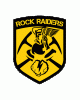
Introducing the TEST Squadron Rock Raider Division! Visit the link to read. More information will be added later and will continue to evolve as we get more information on various aspects of the game. Rock Raiders specializes primarily in Mining and Reclamation/Salvaging with a minor focus in Exploration. but we will work hand in hand with the main TEST exploration arm to ensure all our goals are met.

I am holding a Logo contest for the Division. Anyone interested can either submit there picture here or the main thread. Contest will run until March 31st until I find something that looks really good and blows my mind.

Prize: Anything in the RSI Pledge Store that is 40 dollars and below that can be gifted.
 
Last edited:

K1NG

Captain
Feb 21, 2015
309
180
210
RSI Handle
K1NG_Brit
So are you looking for more of a militaristic style logo or corporate? Sounds like your not going to be shooting much necessarily right?
 

Black Sunder

Rock Raiders
Officer
Jun 19, 2014
8,270
26,834
3,045
RSI Handle
Black_Sunder
So are you looking for more of a militaristic style logo or corporate? Sounds like your not going to be shooting much necessarily right?
More of an industrial looking logo of some kind. Here is the original Lego Rock Raiders logo. I love the drill. It gets to the point quick.


maynard

Space Marshal
May 20, 2014
5,124
20,290
2,995
RSI Handle
mgk
how about a Calvin & Hobbes theme?

Rocks! Lazors! Pew Pew!
 

K1NG

Captain
Feb 21, 2015
309
180
210
RSI Handle
K1NG_Brit
Well I've got nothing else to provide unless you give designer feedback. Thats like saying: "This beer tastes wrong" You need to say why its wrong. Is it dry? Too sweet? etc.

Can't expect someone to provide you the best logo they can if you don't tell people what you're looking for roughly ;)
 

Black Sunder

Rock Raiders
Officer
Jun 19, 2014
8,270
26,834
3,045
RSI Handle
Black_Sunder
Well I've got nothing else to provide unless you give designer feedback. Thats like saying: "This beer tastes wrong" You need to say why its wrong. Is it dry? Too sweet? etc.

Can't expect someone to provide you the best logo they can if you don't tell people what you're looking for roughly ;)
I will try writing a critique for the ones here of what I see later after work.
 

Black Sunder

Rock Raiders
Officer
Jun 19, 2014
8,270
26,834
3,045
RSI Handle
Black_Sunder
@zombiebombie3

I like that you used an actual patch for the logo which cool. But the actual picture confuses me greatly. It isn't well defined as to what it is. And it doesn't say TEST Squadron anywhere. :(

@AntiSqueaker
I like that you used the actual logo as a base. The helmet, pick axe and shovel convey a bit of what we are which is Mining and Salvage. Only problem is the Rock Raiders words in the wings and that isn't your fault. There just isn't really room for more unless you take "TEST Squadron, BEST Squardon" out which you could because everyone knows we are the best.


@Metralla94
1st image. First let me say I absolutely love that you took the drill from the original picture and put it in the logo and did some modification to the picture and added stars. As i said before on Zombie's we need to see TEST Squadron front and center at the top to identify it and we can take out TEST Squadron, Best Squardon and replace it with "Rock Raiders" or "Rock Raider Division". There are several places here I see grey lines that need to be tightened up. The yellow circle being the only yellow on the picture, I don't know how I feel about it right now. It also has edging problems where you used the fill tool and pit pixilated along the edges. And just play with the colors to get more yellow in there.

2nd image: Not sure at the moment. Again edging problems and grey lines. I will say it looks more dynamic. I wish we could combine Anti's and yours somehow to make some super logo somehow.

@K1NG
Yours is very original and I like that a lot. But it needs to look like a patch and not just a picture. I like the rock and the texturing but I feel you went overboard on that part around the outside. Looks very industrial though. I like that.

Did a search for "Photoshop Industrial Text" and found you guys some inspiration:


Hope this helps some.
 
  • Like
Reactions: K1NG
Forgot your password?