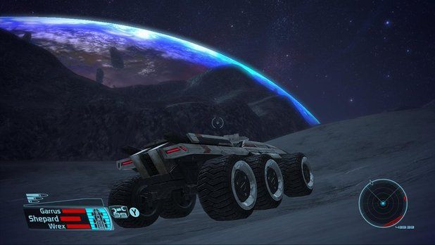
While we are talking about the Carrack and when will be the release date, I'm becoming a little bit frightened that she finally could not look like she was announced to look.
Its coming to me because of the new design of the Ursa Rover - its just terrible!!! Where is the charakter of the vehicle, the future-like look, the coolness? Its all gone!
Remember: this is it what the Ursa Rover was meant to look like:
View: http://i.imgur.com/dxjSQS4.png
And this is its current, final design:

Its just....CRAP!! If there would be Logo like "Dacia" or "Renault" with a "1.2 ecogreen motor" emblem on it I wouldn't even wonder about!
If there has been a disappointment during the GamesCom presentation, this is it, my personal Star Citizen lowlight 2016.
And this is, where my [CONCERN] arises - I hope, really, really, really, really hope that they won't redesign the layout of the Carrack as they now did with the Rover. Don't you dare, CIG...!
Its coming to me because of the new design of the Ursa Rover - its just terrible!!! Where is the charakter of the vehicle, the future-like look, the coolness? Its all gone!
Remember: this is it what the Ursa Rover was meant to look like:
View: http://i.imgur.com/dxjSQS4.png
And this is its current, final design:

Its just....CRAP!! If there would be Logo like "Dacia" or "Renault" with a "1.2 ecogreen motor" emblem on it I wouldn't even wonder about!
If there has been a disappointment during the GamesCom presentation, this is it, my personal Star Citizen lowlight 2016.
And this is, where my [CONCERN] arises - I hope, really, really, really, really hope that they won't redesign the layout of the Carrack as they now did with the Rover. Don't you dare, CIG...!


